Brand Awareness – Part 2
Description-
Find three brands/logos that you really like – can be for any organization, for-profit or non-profit, company, etc. Include the design in your post along with a brief statement about why you find it appealing, history, and what features and treatments allow it to succeed. Any prescriptive advice on improvements is also encouraged.
Roxy Logo-
Roxy was a girls version of the extreme sports clothing store Quicksilver. The Roxy logo is a combination of the Quiksilver logo facing each other with the shape of a heart placed inside. The crest with the shape of a heart embossed brings the soft touch to the Roxy logo and truly shows feelings of affection, compassion, and love while capturing the substance of the brand. I think the Roxy logos is a great logo because it shows the waves of the ocean and still including a girly vibe. The black letters really pop on the white background, so theres good contrast. The Roxy logo was designed in 1993. Overall I think the Roxy logo is a great logo!
Dutch Brothers Logo-
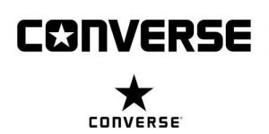
Converse is a world-renowned American fashion company that creates shoes, athletic apparel and sporting goods. It is currently headquartered in North Andover, Massachusetts but it was originally established by Marquis Mills Converse as “Converse Rubber Shoe Company” in Malden, Massachusetts in February 1908. The signature “All Star” symbol was made in 1921. The use of white color in the Converse logo represents purity and charm, whereas the black color stands for excellence and elegance of the brand. Again I think the black on white looks really good. The star fits the shoes perfectly because both girls and boys can wear the shoes. All this information helps me say that the converse is a good logo!
Netflix Logo-
Netflix is a a very simple logo with no symbols. Even though the logo is not very exiting it still interested me. The red makes the black and white stick out. The red color in the Netflix logo represents passion, energy and joy. Whereas the white and black color stands for integrity, elegance and purity of the company’s products. This logo was founded in 1997 in Scotts Valley. It currently has more than 10 million subscribers and a collection of 100,000 titles on DVD. This app is very popular but the logo isn’t. I thought it was pretty cool so I’m glad I learned more about it!
Reflection-
For this project I found three different logos on the web. I researched some of the logos background information. I also shared my opinion regarding the logos. I talked about the contrast, repetition, alignment, and proximity. This project was very interesting because I had no idea what all these logos stood for and if they had a secret meaning. I love learning new things and during this project, I learned a lot of new things. I’m very exited for future projects where I get to learn new things! I’m really enjoying this class and I am so glad I have Mr. Schiff as my teacher:)


