Sep 11 2015
Brand awareness – part 2
Description: Find three brands/logos that you really like – can be for any organization, for-profit or non-profit, company, etc. Include the design in your post along with a brief statement about why you find it appealing, history, and what features and treatments allow it to succeed. Any prescriptive advice on improvements is also encouraged.
Northwest Cristian University logo:
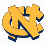
NCU was first called Eugene Divinity school, it went through a couple of other names before it became Northwest Christian University( NCU). I think the NCU logo is a good logo because the N and C cross over each other and the C has a break in the upper right hand side before it intersects with the N and makes a cross which is like a hidden message. Also the yellow and blue look great together. Although this is the NCU sports logo, I think it is better designed than the main one.
Mozilla Firefox logo:

The Mozilla Firefox logo is successful because it pops. The yellow and orange on the blue create great contrast. The Firefox blends the orange and yellow to create the look of fire. The fox looks like it is coming off the blue earth, but at the same time it looks like it is holding the earth like a bowl. The logo has so many things going on and it really catches your eye. The first version of Mozilla Firefox ( Firefox 1.0) was released in 2004, and there have been new versions almost every year since then.
Frito Lay logo:
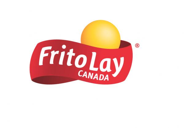
Frito Lay Inc. is part of the Pepsi-Cola company, they came together in 1965.One of the reasons I think the Frito Lay logo is successful because it says the name in white on the red background, which creates good contrast, on the logo, this means it is certain that people will know what the company is. The yellow ball above where it says Frito Lay goes well with the red and it catches your eye.
Reflection: In this activity I picked out logos of brands that I did not use in part one and looked at them from a design standpoint and wrote down what I thought. I chose the logos I did because they caught my eye when i was looking for logos to use. I really liked this assignment.