Recent update
Brand Awarness Activity – Part 2
Part 2 (Separate “Page”): Find three brands/logos that you really like – can be for any organization, for-profit or non-profit, company, etc. Include the design in your post along with a brief statement about why you find it appealing, history, and what features and treatments allow it to succeed. Any prescriptive advice on improvements is also encouraged.
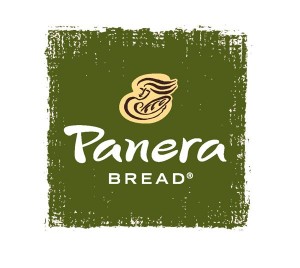
Panera Bread: I really like Panera’s logo because some people don’t take the time to actually look closely and realize that it’s of a woman holding a fresh loaf of bread. I like it because it is also very creative and unique. I also love the contrast of the colors and the font that the creators used. I love this logo but the food is better!
Twitter: I like this logo because its simple, but at the same time really cool because users of this app can “tweet” tweets out to their followers and the name goes with it. I also like this bird flying and the color contrast is pretty. Twitter is one of the most popular social media apps.
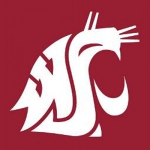
Washington Sate University: This logo is one of my favorites because its so secretive and cool. If you look closely, you will see w s u made into a cougar symbolizing the initials of the university. The creators probably spent a long time trying to come up with this and I thinks its awesome. Plus, my dad and my sister both went there for college.
Reflection: For this assignment I picked my top 3 logos that I admire most and then put them into my ePortfolio then describe why I like it so much. It was hard only picking 3 so I narrowed it down to Panera Bread, Twitter, and the best one, Washington State University. I really liked this assignment because it was fun and super easy.
Pages
- About
- Blog
- Classes
- 3D Design
- Broadcast Media
- Digital Media TA
- Information Design
- Brand Awarness Activity – Part 1
- Brand Awarness Activity – Part 2
- Collateral Pieces Final – Vector
- Collateral Sketches – Templates (Pencil/Pen)
- Final Project
- Graphic Standards – Final
- Logo/Brand Design Sketches – Pencil Paper
- Logo/Brand Final Design
- Name Branding Assignments – 3 Parts
- Organization/Company Questions
- Language Arts 8
- Math 6a
- Photography
- Science
- Social Studies
- Tech Lit
- Community


